Good homepage SEO is vital for ecommerce websites.
The homepage is one of the most important pages of an online shop and it has to be both user-friendly and search engine friendly.
When potential customers visit your store’s homepage, they should be able to see at a glance:
- Who you are
- What you are selling
- Why to buy from you
- How to find the product(s) they are interested in, in the least possible number of clicks.
On the other hand, when a search engine spider crawls the homepage, it should easily extract information about your business, address (if you have a local presence) and products.
Why care about the homepage?
For ecommerce websites, the homepage is the most visited page of the site, even if it is not set as the landing page for PPC campaigns.
- It is the page people might link from their articles.
- It is the page that users will visit to decide whether they should trust this company or not
- It is the page that represents your domain in the SERPS and it will become stronger overtime (and gain higher rankings), as you grow your website.
- It is the page people will re-visit to check if you have new products or offers.
How to SEO your Shop’s homepage
The homepage SEO process is divided into two parts.
The first part is the on-page SEO and the second part is the user optimization process.
Both parts are equally important so there is no question as to which one to do first or second, a properly optimized homepage should incorporate both elements.
Step 1: How to Optimize your homepage for users.
Let’ start with the latter, user optimization.
As mentioned above, a user visiting your homepage has to be provided with information about your company, it’s products and services.
To achieve this goal, you need to pay special attention on the design and structure of the homepage so that it includes all essential elements.
ABOVE THE FOLD CONTENT
The first item in the list is the above the fold content optimization.
What do we mean by ‘Above the fold’? It’s the content that is visible to the user without having to scroll the page.
In other words, when the homepage is fully loaded, what does the user see before touching the vertical scroll bars? That’s the above the fold content.
It’s your first change to win the first impression and encourage users to stay on your website and navigate to your products or services.
If you have the wrong content above the fold, then most probably you will lose most of your potential customers.
What content to have above the fold?
These are the essential elements for the above the fold content.
- Website Logo
- Contact information
- Menu options (The menu options should be based on the results of the keyword research process and the structure of the menu, should match the structure of your shop.)
- Offers or promotions
- Big headline
- Search Box (if applicable)
- Call to Action Buttons
- Link to Shopping Cart or Account Login
The best to way to understand these principles is to look at some of the most successful ecommerce websites on the Internet (and some websites selling services), and see how they are applied in practice.
Although each website shown below is in a different niche and has different marketing goals, when it comes to homepage optimization, they have a lot of similarities.
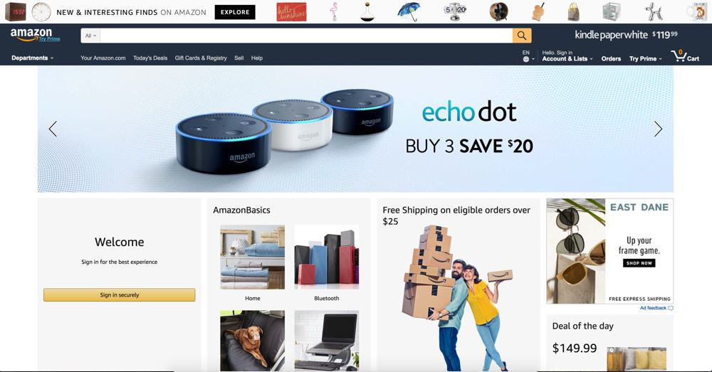
Example 1: Amazon.com
It’s impossible to talk about ecommerce and not mention Amazon. Amazon is the leader in ecommerce with more than 136 billion USD of revenue per year.
When you visit the homepage of amazon.com, you will notice that they take good advantage for their ‘above the fold’ area.
Besides having the logo, search and sign-in button, they have a number of CALL TO ACTION boxes to grab the attention of users from the time they land on their homepage.
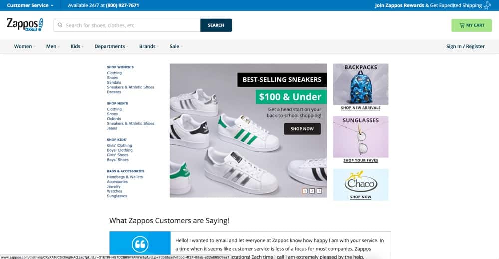
Example 2: Zappos.com
Zappos.com is another popular store and although their home page design is different than Amazon’s, it has the same characteristics as described above.
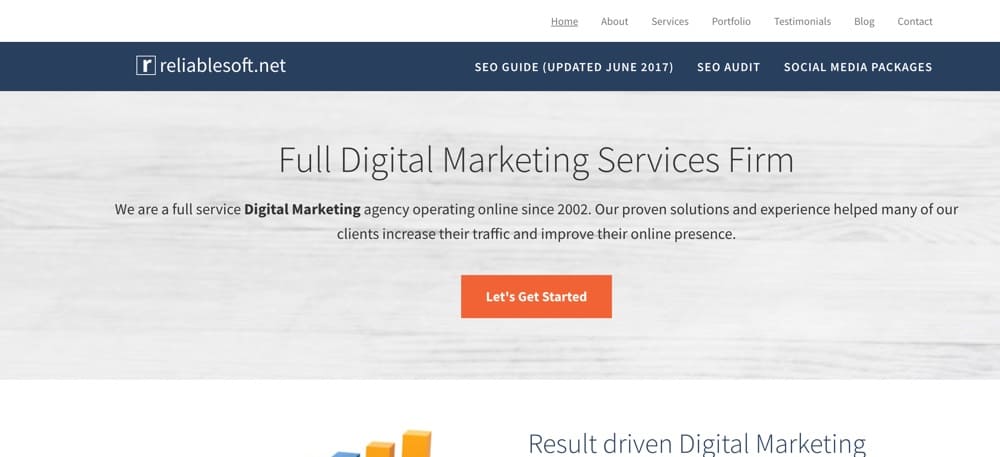
Example 3: reliablesoft.net
If you are selling digital marketing services (like us), you can use the homepage to explain in a few words who you are and what you do and then with a clear CTA, to explain to them what kind of services you are offering.
Special Guidelines for Mobile
It is likely that the majority of organic traffic will be coming to your website from mobile users, so you need to give special attention on how your ecommerce website is shown on mobile devices.
Having a responsive website is a good first step but for online shops you may need to provide users with a more customized experienced for mobiles.
That does not mean that you need to have a version for mobile on a subdomain or a different domain or to maintain a replica of your website for mobile only.
A good developer can make the necessary adjustments to your responsive website so that it renders better on mobiles.
What is so special about mobile?
The available space on a mobile device (that’s the screen width and height) is less compared to desktop and tablets.
Mobile users are mostly on data connections so speed and size of the page are important.
Mobile users are on the go and they need to get the information they want in the fastest possible way with minimum number of distractions.
While you can use a desktop homepage to give them information about your company and welcome them to your store, on mobile your homepage should give users exactly what they are looking for without extra or unnecessary information.
Google has a very nice document about the principles of mobile site design and it is worth reading and following their guidelines. The most important related to an ecommerce website’s homepage are:
- Keep calls-to-action front and center
- Keep menus short and sweet
- Make it easy to get back to the homepage
- Make site search visible (above the fold)
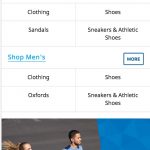
Take a look at the 2 websites on mobile and compare their versions with the desktop to understand how they have customized their homepage to use the guidelines outlined above.
Step 2: How to Optimize your homepage for Search Engines
Search Engine Optimization is for both users and search engines.
The guidelines described above are meant to satisfy the first part of the equation i.e. to make the homepage user friendly.
Let’s see how to make your shop’s home page search engine friendly.
We will examine the following factors:
- Website Security (SSL)
- Home page title
- Home page description
- H1 tag
- Content and Keywords usage
- Images
- Structured Data
- Footer and what content to include
Website Security SSL
Having a Secure Certificate installed on your server and properly configured is a must for all ecommerce websites.
An SSL will ensure that all information transmitted between your website and server is secured. Things like usernames, order information, payment details are all transmitted through a secure server communication.
Besides the security aspect, having an https website will serve 2 more purposes:
- It’s good for SEO. Https is a known ranking signal and although not a significant one, it’s one of those ranking factors that you can easily gain by adding an SSL to your website.
- It’s vital for user trust. When you have an SSL installed, the word secure is shown in the browser window (like the example below) and this increases user trust – a factor that is very important for your online shop’s success.
For more information on how to add an SSL to your shop, read my previous post: How to migrate your website to https.
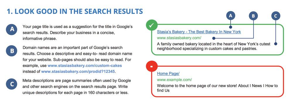
How to optimize your home page title?
The title (<title></title>) tag is very important for SEO purposes for 2 main reasons:
- It is shown in your snippet in the SERPS (search engine results).
- It gives a big hint to search engines on what your website is all about.
To optimize your home page’s title, follow these simple rules:
Titles should be around 60 characters – the reason for this limit is that you want the whole title to be shown in your snippet and not just a part of it.
Include your brand name and location (if you have a local presence – like the example above).
For more information on Local SEO optimization, go through this local SEO checklist.
Important: In case you are selling a particular product or service and you want to optimize your homepage for a specific term, include the keyword(s) first in your title and then the description and brand name.
For example, if you want to rank your homepage for the term “online courses”, then this should be the first word in your title. Look at this example from udemy.com
If length permits, include some benefits in your title like the example below from zappos.com. Notice how they added Free Shipping and Returns in the title.
Use ‘Magnet words’, to grab the attention of the users and increase your CTR (click through rates).
Words like:
- Free Shipping
- Sale
- XX Off
- Money Back Guarantee
- Free Returns
Can be used to make your title more interesting.
Home Page Description Optimization
The description is also important because it may be shown in the SERPS. A good description can have a positive effect on the CTR (click through rate).
While it is up-to Google to decide whether or not to show what your write in the description in the snippet, in the majority of cases for the homepage it will show your version.
Your description should be no more than 160 characters and needs to include:
- Benefits and magnet words.
- Mentions about your location and phone number (if you are selling local).
- A summary of what you are offering.
Let’s see some nice examples from popular websites:
The H1 Tag
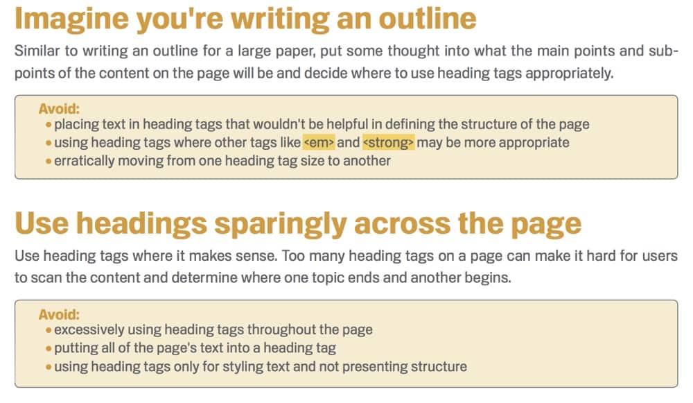
Each and every page of your ecommerce website (including the homepage), should have one h1 tag.
An H1 tag (<h1></h1>) gives another hint to search engines on what the page content is about. It’s another way to highlight the important parts of a page to search engine bots.
A few things you should know about the use of H1 and tags in general:
The h1 tag doesn’t have to be the same as the <title> tag, but it’s ok to be the same! – Most themes automatically output the title of the page as an H1 tag but you can change it to be more informative if you want.
Important: Tags should be used in a hierarchical manner i.e. the first tag found in the html code should be the h1, then you can have h2, h3, h4 etc.
Most WordPress ready-made themes, don’t make use of tags correctly so before deciding which one to buy, check how they are using heading tags and what options they have for optimizing them.
For best results, don’t forget to add your target keywords in the H1 tag.
Let’s see a few examples where the <title> and <h1> tag is used correctly:
Example 1: Teachable.com
Title: Create and Sell Your Own Online Courses | Teachable
H1: Create and sell beautiful online courses
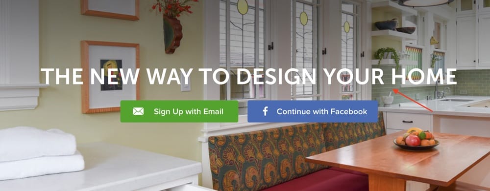
Example 2: Houzz.com
Title: Houzz – Home Design, Decorating and Remodeling Ideas
H1: The new way to design your home
Home Page Content and use of Keywords
Besides the title, description and H1 tag, another important aspect of homepage SEO is the content.
One of the most common mistakes many ecommerce websites are making is not having any text content on the homepage.
They tend to showcase their latest offers or brochures as images but this does not help in SEO.
Instead of having image only content, convert your banners or Call to Action boxes into html so that search engine spiders can understand the content.
Having html code based CTA and banners, is also better for mobile since images with text on top, are not suited for mobile viewing.
What type of content to include on the homepage?
I have mentioned above that your most important messages, CTA’s should be placed above the fold to grab the attention of the visitors but that does not mean that you cannot have text content with your keywords, below the fold.
Amazon and Zappos don’t have to do this because they are known brands and don’t rely as much on search engine traffic, but for smaller ecommerce websites, it is important to have enough content on the home page for SEO purposes.
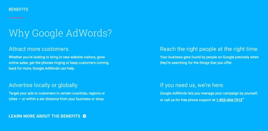
For example, take a lot at AdWords landing page:
They display their CTA and important messages at the top of the page (above the fold) and below in a section style format they explain the benefits and features of their product.
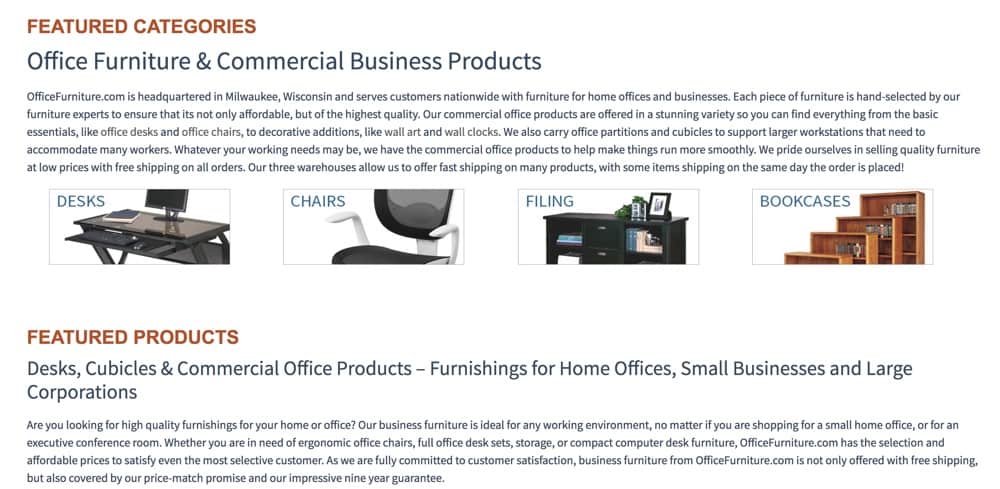
Here is another example from officefurniture.com
Instead of having images of their featured products alone, they also added a bit of text to explain their offerings.
Important: The content on your homepage has to be unique. Avoid using exactly the same text as it is used in other websites on the Internet, even if you are selling the same products or services.
Image SEO
Images are essential for ecommerce websites, especially if you are selling physical products.
Potential buyers before making a purchase, want to see how the product looks and in addition good images can enhance the appearance of your shop and make it less boring.
There are two main issues when using images on your homepage.
First, they increase the time it takes for your homepage to load and second, if not optimized correctly they are not assisting your SEO efforts.
How to optimize images?
Your first task is to optimize their physical size i.e. to resize the images to match the maximum size you are going to use them.
For example, if you have an image that is 1200px wide but it is shown as 450px wide on the website, before uploading to your store make sure that is resized to 450px.
This alone will reduce the file size of the image to 1/3.
Next, before uploading use a tool to further optimize the file size without losing quality.
There are tools like imageoptim that can reduce an image size by 10%-20% without changing the quality.
If you are using WordPress, check that your installation in up-to-date because since version 4.4 WordPress is using responsive images.
Once uploaded to your store, make sure that you use the ALT attribute to describe what’s in the image and in addition to that use a caption below the image to put information in text so that it can be read and understood by search engine spiders.
In the ALT text and caption add keywords naturally in the text but without doing keyword stuffing.
Structured Data
Another element that is important for the SEO optimization of your store’s homepage is structured data.
What is structured data and why it’s important? One of the most difficult tasks search engines have to solve when crawling a page is to understand the context of a page.
By context, we mean to have a clear idea on what the page is all about.
For example, if you have a page with a recipe, search engines try to find out the title of the recipe, ingredients needed, preparation instructions, images, time to complete the recipe etc.
One of the ways to give them good clues is through the page structure, titles, headings, formatting and other on-page SEO techniques but this is not enough.
To make their job easier, search engines have agreed to a pre-defined set of schemas that can be used by webmasters to tag their data so that it’s easier for spiders to understand the meaning of the content.
You can read more about structured data and schemas here:
Schema.org – that’s the official page to find documentation on all available schemas.
Google structured Data resource page – The official Google page on structured data usage.
Structured Data and SEO – one of my previous articles that explains how to implement structured data on your website.
When it comes to ecommerce websites and homepage optimization, structured data can be used to give Google more details about your website and company.
You can implement the organization schema and provide Google information about:
- The company name
- Logo
- Sitelinks
- Contact information
- Social Links
- Search functions
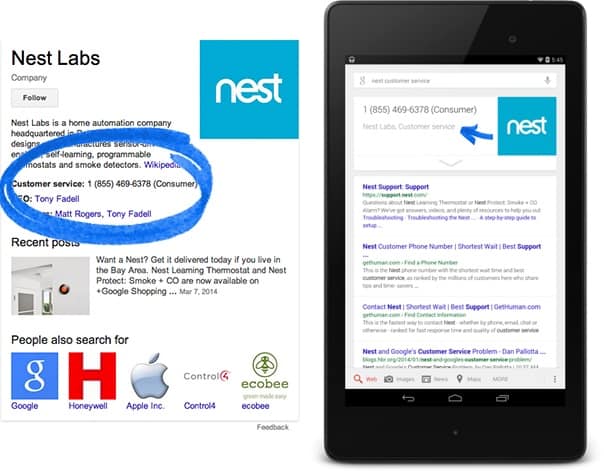
Here is an example of how it will look in Google search results.
A successful implementation of schema will improve the listing of your store in the SERPS by giving more details to users about your company, address, contact info, social presence and many more.
Footer
Last but not least, don’t forget about your website’s footer. The footer is of course part of the homepage and it is shown on all pages the website.
Things to add to your footer:
- A list of links to the main sections of your website. This doesn’t have to be the same as the main menu but use the footer area to give users easy access to the main categories and pages.
- Trust logos – if your company is BBB verified, paypal verified, MacAfee verified or if you are an official representative of a brand, the footer is a good place to add those logos and increase user trust.
- Contact information – Make your phone number and address visible and add links to your contact us page.
- Your logo
- Links to Privacy Policy, Shipping Policy, Lifetime Warranty and user sitemap
- Links to your social media pages
- A way for users to register for your newsletter
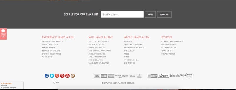
Here is a nice example from JamesAllen.com that incorporates all these elements.
Conclusion
Having an optimized homepage is very important for the success of your ecommerce website.
Before selecting a theme for your store or if you already have a theme, before making any changes to it, consider the following:
Can both desktop and mobile users see as soon as they land on my homepage who we are and what we are selling?
Can they find a product easily either by searching for it or navigating through the menu?
Does the page load fast on both desktop and mobile?
Are my titles and descriptions optimized?
Does the page have a relevant h1 tag?
Do I have enough text content on the page to help search engines understand what I’m selling?
When I test my homepage with the structured data testing tool, is the schema information correct and accurate or does it show any errors?
Is my footer optimized?
Is my website secured (https)?
As a final word, don’t forget that when it comes to SEO for your homepage and website in general, simplicity is always the best approach.
Keep things simple for your users and search engines. Don’t over-do it with graphics or extra elements that don’t serve any real purpose other than satisfying your desire to have a fancy and flashy website.










SEO optimizing the homepage of your online shop will make sure that you attract a lot of consumers, and the products that you are selling are good enough for the customers. I think you should get on this asap.