Landing pages might look simple, but they’re damn hard to get right. Done correctly, you use landing pages to push a huge chunk of traffic into the top of your funnel, and turn it into cash for your business.
Sounds great, right?
Well, the problems start when you push traffic to a landing page that doesn’t get the visitors to take action.
You can have the best acquisition model, pour thousands into Google Ads, and work on the mythical solution to outranking long-form content with a landing page in Google…
But without a good conversion rate, you might as well be flushing that Google Ads money down the toilet, pushing visitors into a dead end, and damaging your rankings with a high bounce rate.
If that’s happening to you (e.g., you have a conversion rate of below 2.35%), then don’t worry.
We’re going to put a stop to that today. I’m going to show you the collected learnings of over a decade of conversion rate optimization study to get your landing page performing in the top 10% and convert at a rate of 11.45% and above.
In this guide, you’ll learn:
- The offers you can make to get your foot in the door
- The secrets of writing copy that makes it impossible for visitors to leave
- How to make visitors instantly trust you
- The proven psychology of effective design
- The common-sense tactics you’re using that are actually massive mistakes
- Why your forms make your most important leads run for the hills
Towards the end of the post, you’ll also get the 15-point high-converting landing pages checklist.
How to increase landing page conversion rate
Follow these tips to improve your landing page conversions rate:
- Use language that resonates with your audience
- Cut your copy down to the bare minimum
- Gain your visitor’s trust
- Use proven psychology for landing page design
- Create an irresistible call to action
- Kill distractions — guide your visitor down one path only
- Optimize your forms to boost lead generation
1. Use language that resonates with your audience
As a marketer, copywriting is the most universally useful tool in your box. Whether you cut your teeth with email marketing, sales letters, or blog posts, you can use everything you already know about persuasive writing to craft landing pages.
There are a billion’ best practice’ articles on the copy, but for our purposes, let’s cut the BS and focus on what matters.
Let’s say you’re selling knitting patterns…
You don’t call them kick-ass ninja patterns for a night out down the pub. You call them charming, timeless and say how handmade knitting makes wonderful gifts for the family because you’re likely selling to people who hold those values.
The simplest way to get into this mindset is to imagine what problem you’re solving for your audience.
Productivity software is there to help people get more done, stop procrastinating, and remember everything. A marketing agency’s services probably won’t make a wonderful gift for your family but will rocket your company’s revenue by improving brand visibility.
Before you can even think about writing good copy, you need to consider the following about your audience:
- Gender
- Age
- Ethnicity
- Family Status
- Income
- Occupation
- Interests
For some products, a few of these points won’t be relevant, but overall it won’t hurt to consider every variable so you can write copy that converts.
Here are a couple of examples:
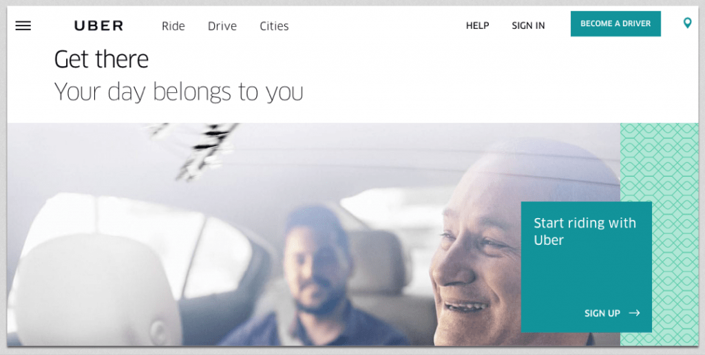
Uber: Get There
From the 7 words of copy on Uber’s landing page, they capture exactly why you should use the service. Because ‘why’ is exactly what people are asking when the land. “Why should I use it?”, “Why shouldn’t I bounce right now?”.
It’s simple. Uber helps you get to where you need to be. You’re busy, your time is important, and you shouldn’t have to think about where to park, getting petrol, or anything other than getting there.
The call to action — Start riding with Uber — uses clear language and tells you exactly what to do next.
Landing pages don’t have to be complex (in fact, they should never be complex), but they do need to use what little real estate they have to make an impact in the mind of the visitor.
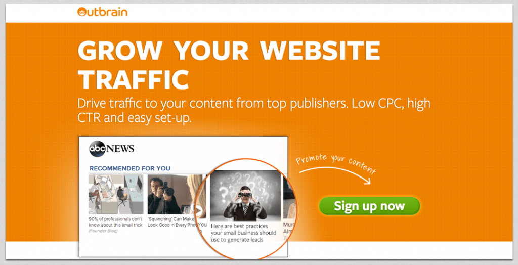
Outbrain: Grow Your Website traffic
Your copy should sell with benefits and support with features. What does this mean? Well, take a look at Outbrain’s landing page. It manages to cram benefits into 20 words of copy, all while not neglecting to show you how the product works.
The audience for this page — marketers and small business owners — doubtlessly want to drive traffic to their content, and are looking for an easy and cost-effective way to do it.
Outbrain instantly positions itself as the ideal solution using copy that speaks the language of its audience. How many times did you hear marketers say they want to ‘grow their traffic’ or ‘drive traffic’ in those exact words? Anywhere you look, that’s exactly how people talk.
And Outbrain knows they don’t have to baby their audience by explaining what CPC and CTR is. If you’re looking at this page, it’s more than likely you’re the right person because you know what CPC and CTR are already.
2. Cut your copy down to the bare minimum
Here’s the mindset of someone that visits your landing page:
They’ve got another 5 tabs open that rank for the same keyword. They’re impatiently cycling through, ruthlessly ‘x’ing off anything that doesn’t instantly promise to solve their problem.
In those cutthroat conditions, you can’t afford to mess around. In fact, a study of 87 landing pages found that the average landing page headline is just 6 words long.
When 80% of people only read the headline, if you can’t communicate your product’s benefits in around 6 word or less, you’re doing it wrong.
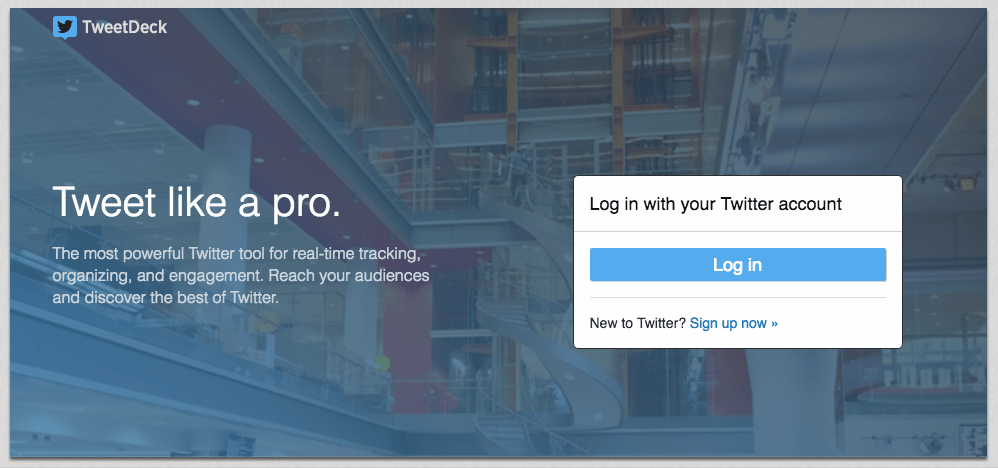
Who would rather not be a pro? TweetDeck — a Twitter management suite — knows that people come to this page to step up their Twitter game. And they manage to hook those people in three short words.
People love to know when they’re being talked about. Not only is it an innate psychological desire to know whether you’re important, it’s also a solid way to get data on your marketing’s effectiveness. Mention sums up their product’s feature in 5 words.
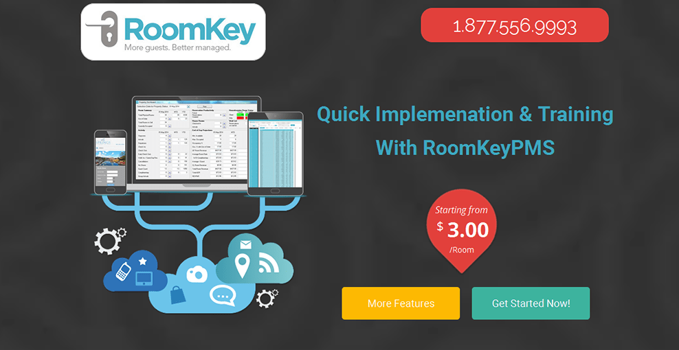
However, you do have to bear in mind that brevity won’t ‘cure what ails ya’ if you write like the garbled translation of a Russian textbook:
This is literally the most confusing landing page I’ve ever seen. I had to calm down from laughing for a few seconds after finding it. Implementation of what? Training on what? Better managed what?!
Only after glancing at it, writing for a few minutes, then glancing back and squinting my eyes did I realize that it’s most likely hotel management software. As far as I know, though, PMS is either a term to do with project management or… something else entirely.
3. Gain your visitor’s trust
We know from Marketing 101 that people will buy from those they know, like, and trust.
Unlike in the ‘real world’, trust doesn’t have to be gained over the period of years with multiple touchpoints. While it does help, you can do it on your landing page with just a few simple elements.
Here’s what you can do:
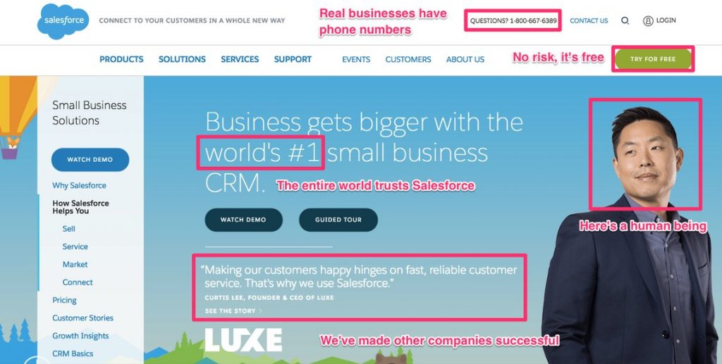
- Add a phone number
- Offer a money-back guarantee
- Include a photograph of a human
- Show that other companies trust you
It’s not necessary to cover all the bases, but 1-2 elements can go a long way.
Let’s look at some examples.
Salesforce is really laying it on thick with this landing page! The messaging can be boiled down to “There’s nothing to worry about (apart from how insanely quickly you’re going to grow your business) when you use the world’s best product that everyone loves”.
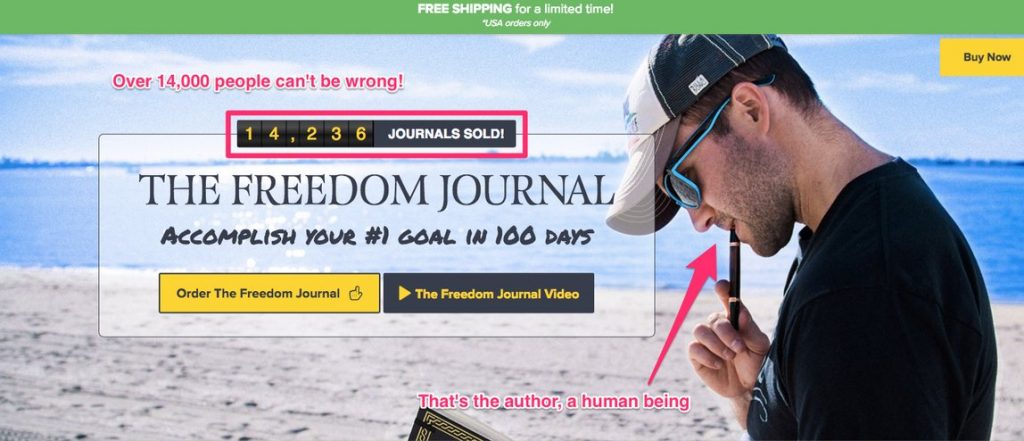
John Lee Dumas’ book, The Freedom Journal, has a very trust-centric landing page. Above the fold shows two things that increase trust — a real person, and social proof.
Further down the page, you get multiple videos of people saying how the book changed their lives, more pictures of the author, and the copy even describes the book as your ‘partner’.
4. Use proven psychology for landing page design
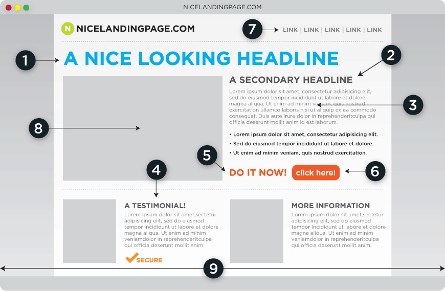
According to Formstack, a landing page consists of 10 elements.
- Matched copy on the ad and the landing page (message match)
- A clear, concise headline
- Body copy with impeccable grammar
- Trust indicators (social proof, logos, guarantees)
- A call to action button
- Elements to draw the eyes to the button
- Every vital element positioned above the fold
- A/B testing
- Visual elements that strengthen the copy
- Minimal links
Let’s use this as a framework and draw on some of the points it makes so we can nail down the design considerations you need to make when crafting a landing page.
5. Create an irresistible call to action
To marketers, the call to action (CTA) is everything. It’s all that matters. If no one clicks it, your business dies and it’s your fault for not making it clickable enough.
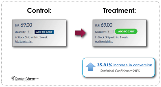
You can make a big difference with CTA optimization:
So, as you might have gathered, a good CTA is vitally important. It’s not ‘just a button’. It’s a button that needs to be given proper thought and design time.
Let’s look at how you can do that…
- Use imperative language in your CTA copy (buy, join, get, start, download)
- Make it stand out from the rest of the page
- Add a sense of instant gratification
Imperative language is the most basic thing your CTA needs. You’ve seen it all before, so it might seem so obvious it doesn’t need to be said, but believe me — I’ve seen some extremely week CTAs.
Here are some good examples:
Every sentence here starts with an imperative.
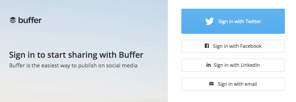
Buffer’s included 5 imperatives here in a small space.
A simple way to get more clicks is to make your CTA button stick out more.
You can even see it in the above two examples: Starbucks would rather you joined than signed in, and Buffer would rather you signed in with Twitter than email, which is why they’ve both highlighted the best choices for them.
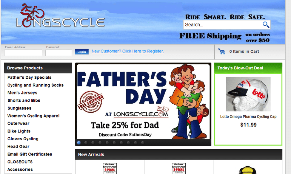
A really bad example:
…This thing’s like Where’s Waldo: The Call to Action Edition.
The third element to include in your CTA is an instant sense of gratification.
Words that offer a sense of instant gratification:
- Now
- Instantly
- Get
- Buy
- Today
- Quick
- Results
- Overnight
- Kickstart
Words that imply delayed gratification, and demotivate visitors:
- Request
- Start
- Learn
- Submit
Instead of implying that the visitor’s about to get caught up in a long and involved process, you need to reassure them that they’re going to ‘get’ ‘results’ ‘now’. See what I did there?!
6. Kill distractions — guide your visitor down one path only
The last thing you want is to pay $10 for someone to come onto your landing page only, navigate to your Facebook, then end up looking at their friend’s cat gifs within 5 seconds.
People are easily distracted. In most cases, you have less than 15 seconds to get the click you want. This means you can’t afford to make mistakes.
Here are a few distracting mistakes landing pages make:
- Tons of different navigation links (home / blog / contact /
- Information about something other than the offer (‘Also check out our latest blog posts! And white papers! And favorite ice cream!’)
- Infuriating opt-in pop-ups
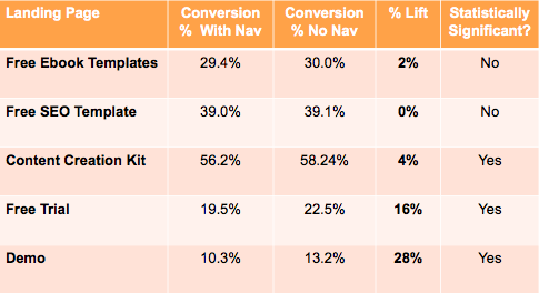
The first thing to do is to cut back on nav links. It’s an old tip, but the data is definitely there to back it up:
When HubSpot did it, it either had no negative effect or a reasonably positive one. Can’t argue with that, right?
Next up, remove the clutter from your landing page. While you might feel fancy including all of your announcements and latest blog posts next to your main CTA, it’s not a particularly good idea because you’d not make as much money if everyone ended up just reading your blog and buying nothing.
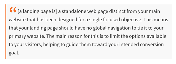
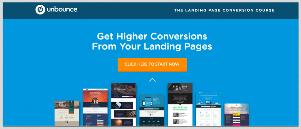
As Unbounce says:
Note that there’s nothing in there about ramming it full of rubbish.
See how clear their landing page is?
You can be absolutely certain they’ve A/B tested it to death!
And finally, you need to disable pop-ups on your landing pages.
Often with pop-up tools, you turn them on and they suddenly start displaying on every page on your domain. For the most part, this is convenient and means you don’t have to set it up page by page. For landing pages, it can really send your conversion rates off the rails.
You don’t want someone landing to buy your $300,000 / year solution and just ending up on your mailing list while paying that money to a competitor.
Like nav bars and unrelated content, pop-ups are a massive distraction. Actually, they’re worse. They’re an annoyance. Annoyed people won’t buy from you.
7. Optimize your forms to boost lead generation
When you go and open a new bank account, I’m certain you dread it as much as I do…
…because it means pages and pages of forms. If they could take an approach like marketers do and just get the email address, that’d be great, right?
Draw on your hellish experiences at the bank and don’t put your prospects through the same trouble:
I can’t tell you what the minimum number of fields you need for your business. If it’s to opt-in for your email list, then you need only their email address. Lead capture forms are trickier, but experiment and try removing fields while maintaining the same level of lead quality.
Check out this nightmare:
And compare it to this:
If necessary, you can always make visitors do the rest of the form later. You need an initial commitment, not their life story, place of birth and the amount they’re planning on depositing in their account every month… Unless you actually are a bank.
High-Converting Landing Pages Checklist
Your 15-point checklist for insanely high-converting landing pages
- Use the same language and tone as your audience
- Cut your copy down to the bare minimum word count
- Add a phone number
- Offer a money back guarantee
- Include a photo of a human
- Show that other companies trust you
- Use imperative language in your CTA copy (buy, join, get, start, download)
- Make it stand out from the rest of the page
- Add a sense of instant gratification
- Continue the conversation going on in your reader’s head
- Cut navigation links off the page
- Remove anything not directly related to your offer
- Disable pop-ups on the landing page
- Take out any superfluous form fields
- Break forms into steps if they have to be long






Thanks for all the excellent information Alex.
Would you consider this page a landing page or a product page? It has a lot of information and traditionally we have been told that long form content is the way to go, but some of your points here suggest that minimal content to drive the action you want is the way to go.
Personally I find the comprehensive information more compelling than just a promising headline.
Hi Graham
Thanks for your comment. There is no right or wrong answer. The best way to find out what works better for your audience is to do A/B testing. Try sending traffic to a long-form landing page and compare the results with sending the same amount of traffic to a shorter page. I know that this is not always easy but it’s the only way to increase your conversion rate based on facts and not theory.
Hope this helps
Alex
Thanks for providing a detailed information Alex. Can you please tell me whether having blogs more than 1000 words and landing pages with more than 1000 words help in conversions?