The ultimate purpose of any website is to generate conversions. A conversion can be the sale of a product or service, the generation of a lead, the click on an ad or simply the registration to an email list.
While the actual design of a landing page can vary depending on the purpose, there are some best practices to follow to make sure that your landing pages’ convert.
What is a landing page?
The first thing that you need to understand is what are landing pages and how they differ from the other pages of your website.
Landing pages serve a specific purpose, they are designed and structured in such a way to lead users execute a specific action. Although they are called ‘landing pages’, these are not necessarily the first page’s users will see when they visit a website.
Usually, when people visit a website organically (i.e. searching something on Google and clicking on a link from the SERPS), they land on a blog page or the home page but when they visit by clicking an ad they usually land on a specific landing page that matches the ad copy.
When to use dedicated landing pages?
When the sole purpose of your website or blog is to get people register to your newsletter then you don’t need a dedicated landing page; a newsletter sign-up box or an exit popup can do the job very well.
In cases though that you want uses to carry out a more ‘complicated’ action like buying a product or service then you need a dedicated landing page. Through a landing page you have a final opportunity to convince users and make them convert.
With that being said, your goal in all the other pages of your website should be to funnel users to your landing page(s). So, your blog posts or home page is the medium to get more visits and your landing page the place to make more conversions.
Anatomy of a perfect landing page
A good landing page has the following characteristics:
It promotes a single product or service
The information on a landing page should be very specific to the product or service it represents. You should not confuse users by giving them more information than they need in order to make a decision as to whether they should convert or not.
Has all the important information above the fold
All important messages, call-to-action buttons and other ‘decision-making’ information should be visible without the user having to scroll down the page.
It loads super fast
If there is a page on your website that you want to optimize for speed, this is your landing page. There is a direct correlation between loading speed and conversions and since this is something you can control; you need to make sure that the page loads as fast as possible.
Use a strong call to action message
A converting landing page has a clear ‘call-to-action’ message. Users need to know exactly what to do next to complete the process. Do not confuse them with a lot of options or buttons that are not related to a conversion.
Clear ‘call-to-action’ buttons
If you want users to buy a product make sure that you have buttons with the words ‘Buy Now’. If you want them to register to a service, then use the words ‘Register here’. Make it specific and not generic.
Branding
Don’t forget to remind users about your brand and why they are visiting your landing page. This is not the page for surprises or for confusing them as to what you do or what you sell.
Headlines and sub-headings
Headlines and subheadings have a very important role to play in a landing page. Through headings and subheadings, you have the opportunity to tell users why they should buy your product or enroll to your service.
Features and benefits
This is the section to describe in a bullet form the main features and benefits of your product. Keep it short and to the point.
Remove the clutter
A landing page is not the place to give users more information that they really need to make a decision. Try to think like a user and keep on the page the information that matters by removing the clutter and other elements that can distract the user attention.
Minimize exit points
You don’t want users to leave your landing page before converting. If you have to give them more information about a feature or benefit, you can either use accordions, information boxes (on mouse over) or open the external links in a new tab so that the landing page will still be available in the background.
Use of images and Videos
Images and videos can add value to a landing page. They can help pass your message in less words (don’t forget the saying ‘an image is worth a thousand words’) and make the whole page more aesthetically pleasing to the eye.
On the other hand, if you use too many images this will increase the loading time of the page and this is not what you want. Use images wisely and optimize their file size as much as possible.
When it comes to the use of videos, make your videos short and to the point (less than 90 seconds) and let the user choose when to view the video (don’t auto play the video when the page loads). Place your ‘call-to-action’ buttons below the videos for easy access.
Use of popups
Although I am not against the use of pop-ups, they are not the best companion for a landing page. Pop-ups can make users angry or confuse them so better to avoid them.
Make data entry easy
If users have to fill in a form to proceed to the next step, then make sure that you make data entry easy by giving them options to select the data or using the auto-fill functions of browsers. You should minimize data entry as much as possible by asking only for the information that you really need and not the information that is nice to have.
One-page checkout
A good landing page makes it easy for users to complete the conversion process. Although the primary concern is to convince users to start the conversion process, it is equally important that they can finish it with the least number of steps.
A one-page checkout is a good approach to minimize the clicks and pages users have to visit before they complete the process.
Make users feel secured
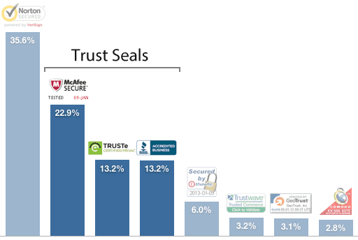
Various studies have shown that in case of landing pages that sell products, ‘trust badges’ can increase conversion rates. The purpose of a ‘trust badge’ is to make users feel safe about the process and confident that the website is secured and trusted.
Reviews and Social Proof
Two more useful elements in any landing page are reviews (or customer testimonials) and social proof.
There are many ways to get reviews from customers, the easiest being emailing them after a purchase and asking them for their feedback or using a third part review system (like yotpo).
Original and honest reviews can help people browsing a landing page to actually convert and proceed to the next step.
Social Proof: People can be positively influenced in their decisions if they see that other people ‘like’ a brand or product. If you have a large following on FB or any other social network that is worth displaying, then add these icons with follower counts in your landing page. If your numbers are still small, you better skip this step.
Contact information and Policies
Make sure that your contact information (phone, address, email) can be seen by the visitors. They may not contact you but it builds more trust if they know that in case of a problem they have a means of getting in touch with you.
Also, every legit landing page should have links pointing to a privacy policy and terms and conditions pages.
Remarketing scripts
Although this is not a visual component, in a landing page you should install your remarketing scripts so that you can re-target users that visited your landing page but did not convert with remarketing campaigns.
Examples of good landing pages
The landing pages below are just a few examples of pages that have the characteristics described above.
Home page of neilpatel.com
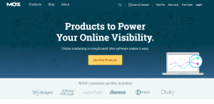
Home page of moz.com
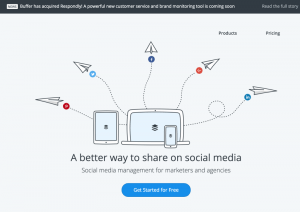
Home page of buffer.com
How to optimize your landing pages
So far we have discussed what elements should a good landing page have but this is not the end of the story. In order to get more conversions from a landing page, you have to optimize it.
In this context, optimization refers to the process of testing different things (layout, colors, messages) and measuring the results with the purpose of getting more conversions.
Some tips to help you do A/B tests successfully:
Test one thing at a time. Don’t make a lot of changes together because you won’t know which change worked for the better or worse.
For example, if you want to change your ‘call to action message’ and color of the buttons, don’t do both changes at the same time. Do the first one and after sometime do the other one.
Know what to measure. When doing A/B tests, you essentially want to compare the performance of a page again some metrics. In general, for a landing page these are:
- Time on page: How much time users spend on the page
- Button CTR: How many people click on the call-to-action buttons
- Conversion rate: The percentage of people that actually converted.
Before doing any changes make sure that you have a way to calculate the above metrics so that you can compare them during the tests.
Percentages are more important than actual numbers. The conversion rate percentage is more important than the actual number of conversions.
If you can manage to increase your conversion rate, then you can send more traffic to the page and make more conversions. So, when doing your tests don’t just count conversions but concentrate more on improving your percentages.
Testing period. When making a change you have to wait for a number of days before making any decissions unless your have enough traffic to reach into conclusions earlier.
If your traffic levels are low, then you really need to wait until your page is viewed by 150-200 people before evaluating the results of your tests.
Landing pages and SEO
In terms of SEO a landing page doesn’t need to be 100% optimized for search engines. This means that while you need to have your titles, descriptions, H1 tags, alt text for images and other essential SEO elements, the content doesn’t have to be SEO friendly but rather more conversion friendly.
In many cases there is no distinction between the two but there are some cases where you need to skip the extra content that search engines would love and stick to the benefits and features part.
The exception to this rule is when a landing page is also a good candidate for receiving organic traffic from search engines. For example, my social media packages landing page, ranks for the term ‘social media packages’ so whenever I make changes to that page I keep SEO in mind.
Landing Pages and Adwords
When you create landing pages to be used specifically for adwords, have the following in mind:
The landing page should match your ads and keep the promises of your ad copy. For example, if you mention in the ad that you offer 10% discount, then this should be clearly shown in the landing page.
Optimize your landing page titles, descriptions and H1 tags so that they are highly related to your ad headline and description. This will not only help users feel that they landed on the correct page but it will also help your ad rank.
Conclusion
Landing pages can help you achieve more conversions. The main difference between a landing page and a normal page or post is that they have a clear and specific purpose. Once you get users on your landing pages, eliminate all destructions and make it super easy for them to proceed to the next step.
The first step when designing your landing pages is to make sure that you have incorporated into your design the core elements as explained above.
The second step is to make sure that you can correctly measure the effectiveness of your current page and the third step to start making A/B tests with the goal of improving your conversion rates.
Depending on your traffic levels, the landing page optimization process can take a number of days or weeks. Don’t rush into conclusions too quickly, give it some time and work through your tests until you achieve the greatest conversion rate possible.



Landing page is a first thing which can leave a good impression on our users. We can say it the door of a website so it depends on this structure that it can make user satisfied or not when they wants to came and read about us.
Hi, Alex!
Landing page optimization is one of the most important factors to get a high rate of conversion. It is the most important page of website. Very well explained the concept of the landing page and some important tips and ways to make it more effective. Thanks for sharing the great piece of content.
Keep doing a good job.